Capture the Mobile Majority: Tips for Optimizing Your Dealership Website for Today’s Smartphone Shoppers
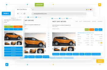
In today’s digital world, mobile devices reign supreme. This trend extends to car shopping, with an ever-increasing number of potential buyers using smartphones and tablets to research vehicles, compare prices, and find dealerships. To stay ahead of the curve and capture this “mobile majority,” your dealership website needs to be optimized for a seamless user experience on all devices. This is where responsive website design comes in. By creating a website that adapts seamlessly to different screen sizes, you ensure a smooth and engaging experience for smartphone shoppers, ultimately driving more leads and sales.
The Rise of the Mobile Car Shopper
Smartphones have become an essential tool for car shopping. Consider these statistics:
- Over 70% of car buyers use smartphones to research vehicles before visiting a dealership.
- Mobile devices account for a significant portion of website traffic for car dealerships.
- A poorly optimized website on mobile can lead to frustrated users who abandon your site and turn to competitors.
Responsive Design: The Key to Mobile Success
Autoxloo’s responsive website design ensures your dealership website adapts to any screen size, from desktops to smartphones. Here’s why it’s crucial:
- Optimal User Experience: Responsive design guarantees a smooth and visually appealing experience for mobile users, allowing them to easily navigate your website and find the information they need.
- Improved Search Engine Ranking: Google prioritizes mobile-friendly websites in search results. Responsive design ensures your dealership ranks higher in mobile searches, increasing your visibility to potential buyers.
- Increased Engagement: A user-friendly mobile website encourages shoppers to stay on your site longer, browse your inventory, and ultimately contact your dealership.
Practical Tips for Mobile Optimization
Beyond responsive design, here are actionable tips to further optimize your dealership website for mobile users:
- Simplify Navigation: Use clear and concise menus with large, easy-to-tap buttons.
- Optimize Images: Ensure images load quickly and resize automatically for smaller screens.
- Prioritize Contact Information: Make your phone number, email address, and location easily accessible with click-to-call functionality and one-tap map directions.
- Highlight Calls to Action (CTAs): Use clear and concise CTAs like “Contact Us” or “Request a Test Drive,” optimized for easy tapping on mobile devices.
- Invest in Fast Loading Speeds: Mobile users are less likely to wait for slow websites. Optimize your website for quick loading times on all devices.
Unlock the Power of Mobile Shoppers
By optimizing your dealership website for smartphones and tablets, you can capture the growing mobile majority. A user-friendly and engaging mobile experience will keep potential buyers on your site, generate more leads, and ultimately drive sales for your dealership. Contact Autoxloo today and discover how our responsive website design solutions can transform your online presence and attract mobile car shoppers.
Don’t let your website be a roadblock for mobile shoppers! Embrace responsive design and optimize your website for a smooth mobile experience. Autoxloo is here to help you capture the mobile majority and take your dealership’s online presence to the next level.


