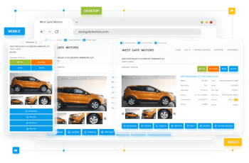
Call-to-Action – an Appropriate Way to Tell Your Customers What to Do

How great it would be if you could tell your customers exactly what you want them to do: schedule the test drive, contact sales staff, leave a feedback, subscribe to newsletter, etc. And it wouldn’t look like you force them, but invite to take an action.
This story comes alive with calls-to-action (CTAs) – the buttons, located in the specific places of your dealership website in order to generate more leads. Designed as the imperative verbs, CTAs provoke an instant response.
Calls-to-action guide visitors through your website and prompt them to take the next step of the buying process. How often were you ready to make a purchase whether online or at the brick-and-mortar store, but there was nobody to ask a question or to pay to. With CTAs your customers will never be lost, instead you can provide them with the online path to purchase.
Where to place the CTAs?
There is no unified solution when it comes to CTAs placement. It’s not because marketers don’t do their work, but because different factors caused this placement to vary. The positions highly depend on the complexity of a page.
Above/Below the fold
Let’s start with defining ‘the fold’ itself. What is it and where is it? The origin of this division came from the world of print. The upper half of the front page of the newspaper where the most enticing news or photographs are placed is called above the fold.
In web design above the fold is considered as a portion of webpage that is visible without scrolling. You’ve probably heard the mantra: put all the key information up top (as well as the CTAs) and the minor down below.
Well, if only could things be so easy and defined. The placement of the CTAs heavily depends on the type of the page and the content within it.
To put it in perspective for you: do you use the same approach to all the types of customers that come to your showroom? The twenty-something girl and sixty-something couple will be treated differently, right? So, why one general rule should be applied to different websites?
Putting the CTA above the fold is suitable for the short web pages with main information which briefly describes the benefits from cooperating with you.
Below the fold placement is good for the long pages that require some acquaintance with a content to make a decision. If your value proposition doesn’t fit in 2 sentences, and to get to know the uniqueness of your offer visitor will need a reasonable amount of copy, place your CTAs below the fold.
Of course, you can duplicate calls-to-action and put the same buttons above and below the fold as well.
Another way to deal with placement question is setting up the floating CTAs, which will always be visible and will just follow the user down the page while they read.
Left/Right
This is another issue that depends on user behavior, but in this case there is a science behind it. The reading gravity, described by the Gutenberg Diagram is a way the Western world people scan the web pages: left-to-right. To apply it on a page, write the imaginary ‘Z’ letter on it. Two right ends of Z mark the areas where viewers look the most often. So the answer is right side of the page is more suitable to place CTAs.
CTAs in blogs/articles?
An effective CTA will increase your auto dealership sales by driving users down the funnel to a sale. It is obviously useful to put CTAs on the main page, but what about other places: blog, news, articles?
You definitely can and should dilute your content with CTAs. Explain the value of taking that action to your users and go ahead. For example:
Awareness: Click here to get to know the safest car of the 2017.
Expertise: Call us today to talk to the consultants with 15+ years of experience.
Incentives: Sign up for our newsletter and get the 10% discount on repair services.
What to write?
Customers come to dealership website with the distinct range of purposes. You as a professional can predict some of them. Aside from ‘Contact us’, ‘Live chat’ and ‘Email us’ buttons you can use following:
- Explore offers
- Shop inventory
- Schedule a test drive
- Make an appointment
- Value your trade
This is just a few examples of CTAs for car dealers, being a dealer yourself, you can definitely continue the list with some incredible ideas. You can add various calls-to-action by your choice – be creative, but also be consistent. If you claim to “click” to learn about used vehicles, don’t redirect your customers to the irrelevant page.
How to measure the effectiveness?
Every activity regarding online marketing should be measured and evaluated. You need to know which calls-to-action really work and which don’t. Google Analytics is a great tool for measuring the effectiveness of your CTAs.
To see how it goes in blog, i.e. which CTA has got the biggest engagement, you can add the UTM code to URL to see how much traffic that specific CTA is driving.
Everything matters when it comes to calls-to-action: size, shape, color, font and of course, placement. Autoxloo have an expertise to help you generate more leads with the thought-through CTAs. Call us today and let’s talk business.


 Search ads
 Mobile ads